Photos from Sunday's consecration ceremony for the temple. The land was bought in 1984. It's taken 25 years (helped by the steady growth in the size of the Indian community) to pull together the money to build the temple.

Making sushi at home
Making sushi at home is easier than making pie.
Cucumber, avacado and smoked salmon rolls:
1) Add 3 tbsp vinegar, 1/2 tsp salt and 1 tbsp sugar to 1 cup cooked rice
2) Put seaweed sheet on bamboo mat (makes rolling it easier)
 3) lay out vegetables on one end, then roll towards the other
 4) Slice the roll and voila ...
p.s. the rolls are for tomorrow afternoon's Summer BBQ at J.'s, if you are coming!
Cucumber, avacado and smoked salmon rolls:
1) Add 3 tbsp vinegar, 1/2 tsp salt and 1 tbsp sugar to 1 cup cooked rice
2) Put seaweed sheet on bamboo mat (makes rolling it easier)
 3) lay out vegetables on one end, then roll towards the other
 4) Slice the roll and voila ...
p.s. the rolls are for tomorrow afternoon's Summer BBQ at J.'s, if you are coming!


Somehow not charming
Reston, Virginia has a walkable, compact towncenter.
 Water fountain
 Flowering lamp posts
 Coffee shop
But when you're there, you have this nagging feeling that something's not quite right. The water fountain is not a central gathering place -- instead, a skating area across from it is. The lampposts are not really on the sides of the streets, but are in plazas next to restaurant seating areas. The coffee shop turns out to be a Panera Bread that's on the ground floor of a Hyatt.
 Water fountain
 Flowering lamp posts
 Coffee shop
 But when you're there, you have this nagging feeling that something's not quite right. The water fountain is not a central gathering place -- instead, a skating area across from it is. The lampposts are not really on the sides of the streets, but are in plazas next to restaurant seating areas. The coffee shop turns out to be a Panera Bread that's on the ground floor of a Hyatt.
So much public interest in microwave satellite retrieval?
 A University of Maryland researcher wanted to come to Norman to consult with us because he is using our nowcasting technique on satellite data. I asked him to give a seminar since he was going to be at the National Weather Center anyway.
Imagine my surprise when, on my morning commute this morning, there was an announcement on the local radio station for a seminar on "microwave satellite-based rainfall improvements". And in my inbox, a media request to talk about the seminar. It must be a really slow news day!
Folks, this will be a very technical seminar. Not really meant for the general public.
R to the rescue
I wanted to create a graph for a paper I was writing. A rather complex graph that would show the difference between six different techniques on five different types of storms on three different criteria. Representing 6x5x3=90 interactions in an easily interpretable way is hard, especially if you want to do it with confidence bounds and the like. I had a general idea of how to create the graph and was wincing internally at the thought of doing it in Excel. Chances are that I would have to rerun the cases if I discover problems and will have to regenerate the graphs quite often. Enter the statistical package, R.
This is the final graph, so you know where I'm going with this:
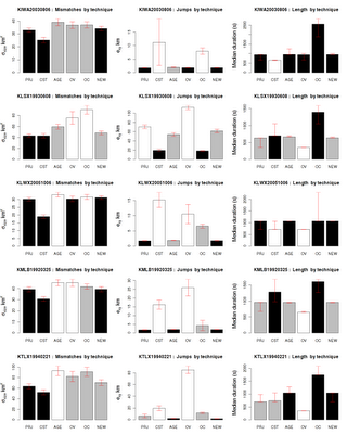 and this is the description of the graph in the paper so that you understand the comparisons made possible by the organization of the graph:
I first put all the numbers into a text file. Then, I ran the R script, snippets of which are below.
First, read the data and set up margins for the plot. The output will go into a PNG image:
This is the final graph, so you know where I'm going with this:
 and this is the description of the graph in the paper so that you understand the comparisons made possible by the organization of the graph:
Each row of graphs consists of the evaluation of a case on the three criteria described in Section 1b. In each graph, the best two methods are shown in black. If several techniques tied for second place (within the bounds of statistial significance shown by the error bars) as in the case of mismatches for the first case, there may be more than two black bars in a graph. Similarly, the worst two methods (with a rank of 5 or 6) are shown with white bars. Gray bars indicate middling (rank of 3 or 4) performance.So, here are the issues: (1) create a figure with multiple graphs (2) arrange them (3) have Greek symbols for the y-axes (4) The barplot should have different colors indicating rank (5) Should have confidence intervals (error bars) on all the graphs.
I first put all the numbers into a text file. Then, I ran the R script, snippets of which are below.
First, read the data and set up margins for the plot. The output will go into a PNG image:
library(lattice)We want 5 rows and 3 columns. Set up column names:
library(MASS)
png( filename="allscores.png", width=1200, height=1500, pointsize=20 );
par(mar=c(3.1, 4.3, 4.1, 1.1))
data <- read.table("allscores.csv", header=TRUE, sep=",");
par( mfrow = c(5,3))Loop through and pull out the data:
technique <- data[1:6,2];
ylabels <- c( expression(sigma[size]~km^2), expression(e[xy]~km), "Median duration (s)")
shortstat <- c( "Mismatches", "Jumps", "Length")
for (caseno in 1:5) {Set up the colors for the bars in the barplot:
startrow <- caseno*6 - 5;
case <- data[startrow,1];
for (statno in 0:2) {
values <- data[startrow:(startrow+5) , 3+statno*4];
valuesLB <- data[startrow:(startrow+5) , 4+statno*4];
valuesUB <- data[startrow:(startrow+5) , 5+statno*4];
rank <- data[startrow:(startrow+5) , 6+statno*4];
colors <- c("gray", "gray", "gray", "gray", "gray", "gray" );Draw the bar plot:
for (i in 1:6){
if ( rank[i] == 1 || rank[i] == 2 ){ colors[i] = "black"; }
if ( rank[i] == 5 || rank[i] == 6 ){ colors[i] = "white"; }
}
xpoints <- barplot(height=values, col=colors, ylab="", names=technique, xlab="Draw the error bars:
", ylim=c(0,max(valuesUB)) )
lh <- 0.2;Set up the title, increasing the font of the y-axis by 40%:
segments(xpoints, valuesLB, xpoints, valuesUB, col="red")
segments(xpoints-lh, valuesLB, xpoints+lh, valuesLB, col="red")
segments(xpoints-lh, valuesUB, xpoints+lh, valuesUB, col="red")
title(ylab=ylabels[1+statno], cex.lab=1.4)and voila ... The neat thing is that I can now run this script on my data file and get the graph. No pointing and clicking required ...
title(main=paste(case,": ", shortstat[1+statno]," by technique") )
Healthcare reform should not expect doctors to be saints
 Atul Gawande (professor of surgery at Harvad, practicing physician and staff writer for the New Yorker) gave the commencement address to the University of Chicago Medical School. You should read the whole thing but here is his key point:
No one talks to you about money in medical school, or how decisions are really made. That may be because we’ve not thought carefully about what we really believe about money and how decisions should be made. But as you look across the spectrum of health care in the United States—across the almost threefold difference in the costs of care—you come to realize that we are witnessing a battle for the soul of American medicine. And as you become doctors today, I want you to know that you are our hope for how this battle will play out.
Earlier in the speech, he talks about some doctors who did make a difference:
He is a physician here in Chicago. He’d invested in an imaging center with his colleagues. But they found they were losing money. They had a meeting about what to do just a few weeks ago. The answer, they realized, was to order more imaging for their patients—to push the indications where they could. When he realized what he was being drawn to do by the structure he was in, he pulled out. He lost money. He angered his partners. But it was the right thing to do.In each case, the doctors had to fight the temptation that our health care system throws in their path -- incentives in our health care system that are stacked in favor of overtreatment.
[...]
To insure that unnecessary costs are avoided ... surgeons agreed to do no operations on lung-cancer patients unless the pulmonologist and oncologist agree that it is indicated. This is radical. “I have had to swallow my ego repeatedly to stick to this principle,” he said. Sometimes he’s had to persuade them an operation was best. More often, however, they persuade him to drop his plan and with it the revenue. And he did—because it was the right thing to do.
Rather than hoping that every doctor becomes a saint, can we not change these incentives? Incentives in medicine should be oriented towards keeping patients healthy, not towards making hospitals and imaging centers profitable.
Subscribe to:
Posts (Atom)