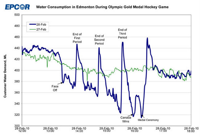
 You can over-analyze this graph, but I just want to point out that folks were pre-clearing their bladders for the game (compare the water usage just before the game started with the green baseline). Then, you can literally hear their thoughts as they decide to hold off to the end of each quarter and the medal ceremony.
Priceless view into the madness of crowds.
Not quarters ... 3 'periods' ... anyway, this is a wonderful example of the power of a graph. It's definitely a well-done figure! Thanks for sharing this.
ReplyDelete