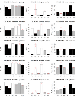
This is the final graph, so you know where I'm going with this:
 and this is the description of the graph in the paper so that you understand the comparisons made possible by the organization of the graph:
Each row of graphs consists of the evaluation of a case on the three criteria described in Section 1b. In each graph, the best two methods are shown in black. If several techniques tied for second place (within the bounds of statistial significance shown by the error bars) as in the case of mismatches for the first case, there may be more than two black bars in a graph. Similarly, the worst two methods (with a rank of 5 or 6) are shown with white bars. Gray bars indicate middling (rank of 3 or 4) performance.So, here are the issues: (1) create a figure with multiple graphs (2) arrange them (3) have Greek symbols for the y-axes (4) The barplot should have different colors indicating rank (5) Should have confidence intervals (error bars) on all the graphs.
I first put all the numbers into a text file. Then, I ran the R script, snippets of which are below.
First, read the data and set up margins for the plot. The output will go into a PNG image:
library(lattice)We want 5 rows and 3 columns. Set up column names:
library(MASS)
png( filename="allscores.png", width=1200, height=1500, pointsize=20 );
par(mar=c(3.1, 4.3, 4.1, 1.1))
data <- read.table("allscores.csv", header=TRUE, sep=",");
par( mfrow = c(5,3))Loop through and pull out the data:
technique <- data[1:6,2];
ylabels <- c( expression(sigma[size]~km^2), expression(e[xy]~km), "Median duration (s)")
shortstat <- c( "Mismatches", "Jumps", "Length")
for (caseno in 1:5) {Set up the colors for the bars in the barplot:
startrow <- caseno*6 - 5;
case <- data[startrow,1];
for (statno in 0:2) {
values <- data[startrow:(startrow+5) , 3+statno*4];
valuesLB <- data[startrow:(startrow+5) , 4+statno*4];
valuesUB <- data[startrow:(startrow+5) , 5+statno*4];
rank <- data[startrow:(startrow+5) , 6+statno*4];
colors <- c("gray", "gray", "gray", "gray", "gray", "gray" );Draw the bar plot:
for (i in 1:6){
if ( rank[i] == 1 || rank[i] == 2 ){ colors[i] = "black"; }
if ( rank[i] == 5 || rank[i] == 6 ){ colors[i] = "white"; }
}
xpoints <- barplot(height=values, col=colors, ylab="", names=technique, xlab="Draw the error bars:
", ylim=c(0,max(valuesUB)) )
lh <- 0.2;Set up the title, increasing the font of the y-axis by 40%:
segments(xpoints, valuesLB, xpoints, valuesUB, col="red")
segments(xpoints-lh, valuesLB, xpoints+lh, valuesLB, col="red")
segments(xpoints-lh, valuesUB, xpoints+lh, valuesUB, col="red")
title(ylab=ylabels[1+statno], cex.lab=1.4)and voila ... The neat thing is that I can now run this script on my data file and get the graph. No pointing and clicking required ...
title(main=paste(case,": ", shortstat[1+statno]," by technique") )
No comments:
Post a Comment